Explain the offer early.
The opening names the offer. A sample decision brief then makes the advisory work concrete, before the visitor explores the three areas of expertise.
Self-initiated concept / 01
An original website concept for a fictional advisory practice. A study in making an abstract service easier to understand through content, typography and navigation.
Open the concept demo ↗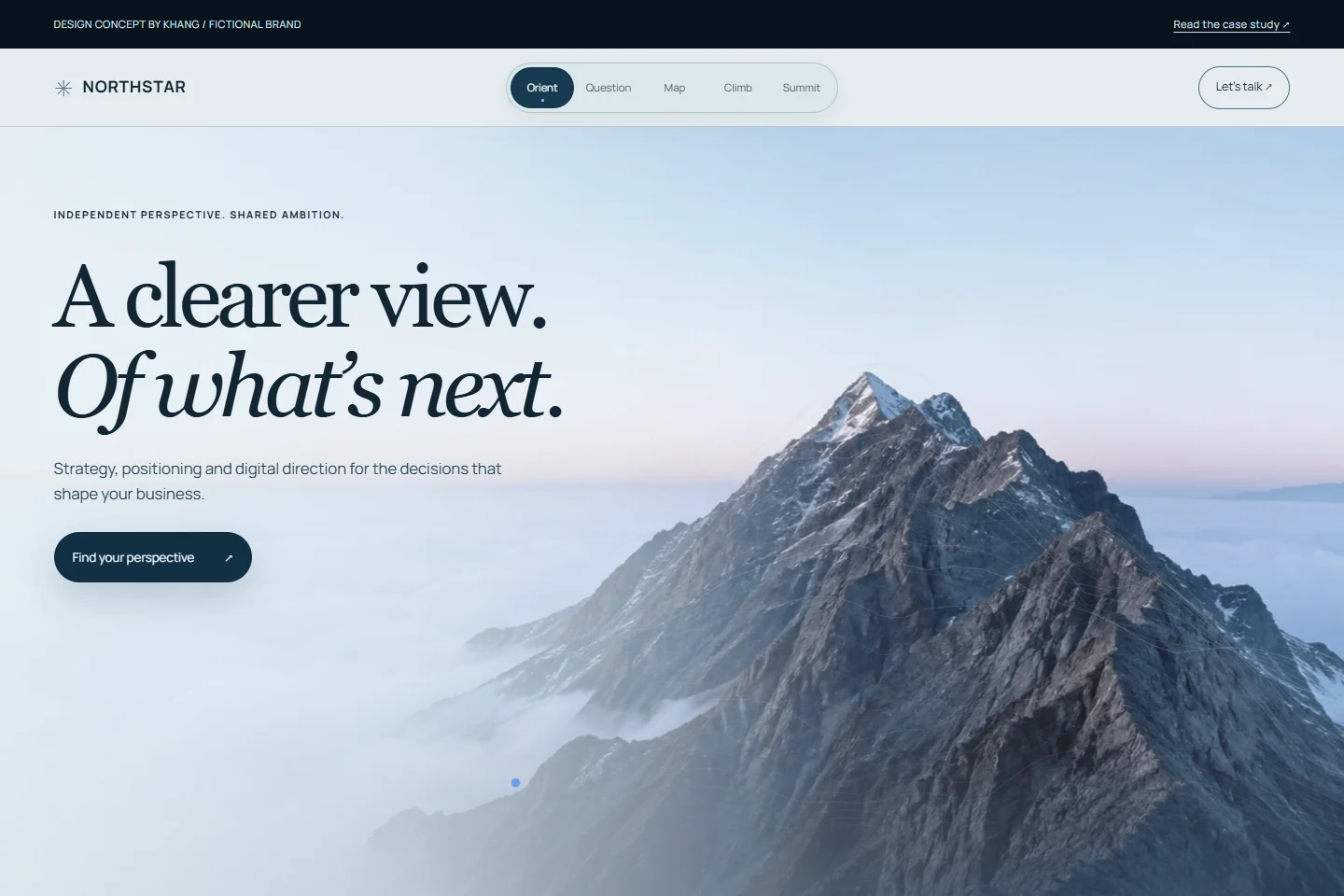
01 / The assumed brief
Northstar is imagined as a practice working across business strategy, brand positioning and digital direction. The brief: explain those services, show how an engagement starts, and make the enquiry path easy to find.
Founders and business leaders considering a new offer, a change in positioning or a better digital presence. This is a design assumption, not a finding from customer interviews.
02 / Design decisions
The opening names the offer. A sample decision brief then makes the advisory work concrete, before the visitor explores the three areas of expertise.
An expansive alpine image, an ice-blue and slate palette, and editorial serif headlines give the advisory concept a clear sense of perspective. The image is an original AI-generated concept asset, not a photograph of a client location.
Expertise and approach links lead to meaningful sections. The contact area clearly identifies the site as a demo and routes website enquiries to LTK Atelier, not a fictional consulting team.
03 / Content before decoration
The working demo is one page. These are its real sections, not a claim that a six-page client site was delivered.
An alpine hero responds to the pointer. The next section names the tension: more options do not always mean direction.
A fictional offer brief compares three routes and shows what a proposed direction would actually contain.
A horizontal terrain connects business strategy, brand positioning and digital direction. On mobile it becomes a touch-scrollable rail.
A compact process leads into the scroll-driven summit scene. The route draws as the visitor moves forward.
The closing identifies this as a concept and links to LTK Atelier for a real website enquiry.
04 / One system, different screens
On narrow screens, the editorial grid becomes a single column. Navigation wraps into its own row, text stays readable and links have room for a finger. The demo uses no video player or UI framework.
Try the responsive demo ↗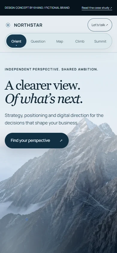
05 / The outcome of this study
This study contains no customer interviews, live business data or measured commercial results. It demonstrates design and implementation decisions—not a conversion or search-ranking guarantee.
A direct partnership
The same considered process can start with your offer, your audience and your goals.
Discuss your website [email protected]